How might we make drop-shipping as easy as chatting for both suppliers and resellers
Motivation
Joovlin is an e-commerce platform for sellers. The company’s goal is to help retailers get access to product supply with no capital needed. Joovlin started as a Fintech company started one year ago with payment processing for business transactions. It subsequently pivoted to building products that support business owners and young entrepreneurs who make a living through trading on social media.
I found this idea very interesting as well as the startup culture, so, I was invited to join the team during the semester.
I was onboarded with reports of the startup’s problem and user research. Insights showed the urgent need to build a mobile application to replace the web product with additional features. My focus was to help the team apply insights from their user research to build an MVP of the product.
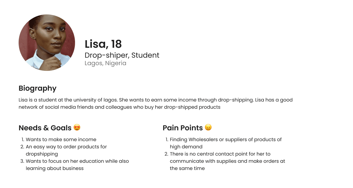
User Persona
Wholesalers/ Suppliers are onboarded on the app and allowed to create a business group. They invite their customers (Traders, Resellers) who also are required to signup and join the business group. Suppliers can add items/products to their catalogue and resellers recieve real-time notfications, view and purchase the items/products and payments are made through the app. The app has a chat interface that allows real-time communication between the Supplier and Resellers on the group.
Supplier Persona
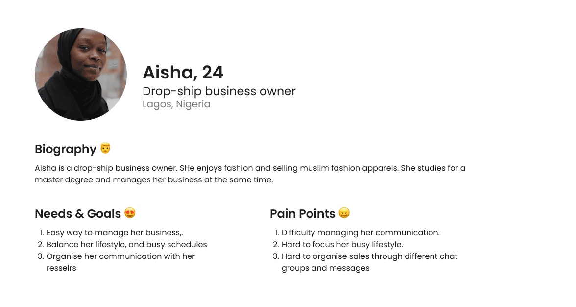
Resseller Persona
Project description
Wholesalers/ Suppliers are onboarded on the app and allowed to create a business group. They invite their customers (Traders, Resellers) who also are required to signup and join the business group. Suppliers can add items/products to their catalogue and resellers recieve real-time notfications, view and purchase the items/products and payments are made through the app. The app has a chat interface that allows real-time communication between the Supplier and Resellers on the group
Requirements
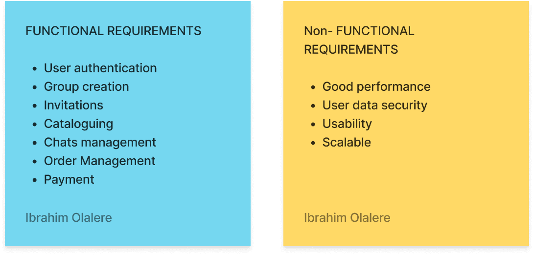
The first mission was to roughly list out the functional requirements from the beginning. I sat here with the product owners to understand what they where trying to build and what functions needed to be part of the product. Next, I wrote down some non-functional requirements (not that they were needed for me ), but in the end I let the software engineers on the team figure out the non-functional requirements.
Breadboarding
The first mission was to roughly list out the functional requirements from the beginning. I sat here with the product owners to understand what they where trying to build and what functions needed to be part of the product. Next, I wrote down some non-functional requirements (not that they were needed for me ), but in the end I let the software engineers on the team figure out the non-functional requirements.

User Stories
For me the next step was priotizing this features and writing out user stories for each functions. We decided to start with the User authentication step because it would help introduce the other member of the tem with working with Jira and how we could work together using user stories.
The breadboard points were easily converted into epics - from which I derived user stories. In the beginning of the project, I write descriptions because the login and signup was self explanatory and developers could easily manage that. Since I was also the designer, it didn’t feel right to explain to myself.
Later during the project, we had meetings where I explained each user stories for clarity sake. I found out this method was more potent than writing descriptions.
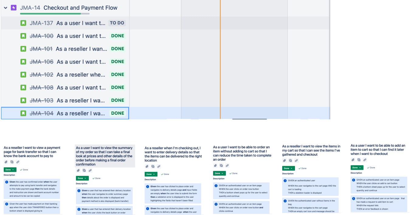
Acceptance criteria
Also during this meetings, we discussed the acceptance criteria for each story. However, for the purpose of this module, i took time to write out acceptance criteria for each module. I found this step difficult because the product owner was on the team and he is also a software engineer. He prefared discussing the acceptance criteria with the other software engineers but not me. But I tried to work on them on my own having it in mind that I understand the concept.
Priotization
Since the goal was to release an MVP - we had to let go of some functionalities in the beginning. In fact, some of these functionalities did not make it into the epics and user stories.
And from the user stories, we had to let go of some key features for the beginning. I had several meetings spread accross different weeks on what features needed stories and what soties were most important to start with.
For me, this wasn’t a smooth process because sometimes, we had to re-priotize and change our mind very frequently
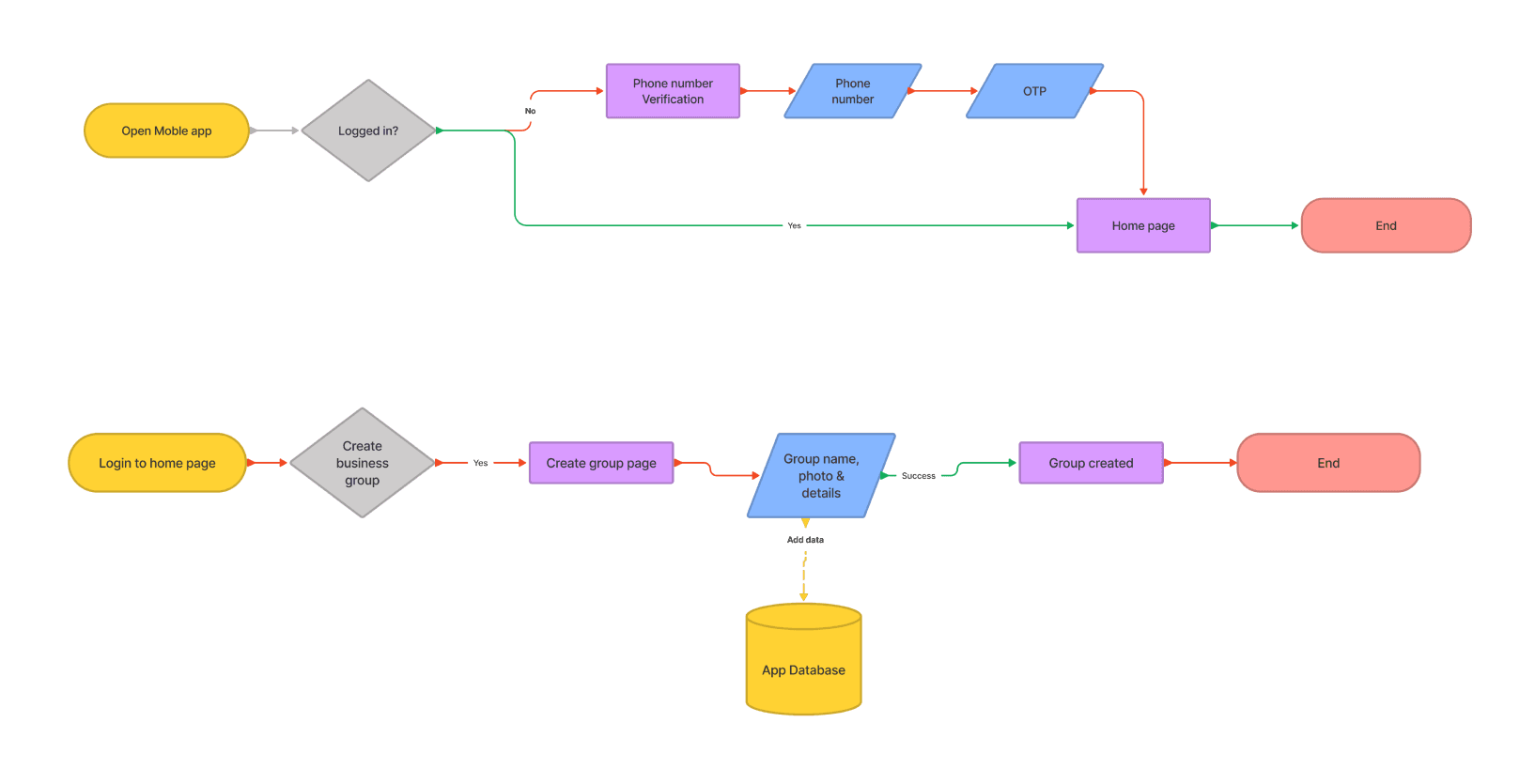
Task flow
I normally find it easir to simply create task flows using pen and paper. That way my ideas are crude and easier to put down. However, I made this using Figjam to make it look better and more organised. I struggled with differentiating between User flows and Task flows. In the end, I decided to create what worked for me, which is creating a flow of each story and having an idea of how the link with other stories in mind. I created only few flows in the beginning and decided to work through the other stories later (after the first sprint) This process helped have a somewhat broader idea of the entire app by narrowing down on individual features/stories. I am still exploring for better approach of this step.
Wireframes
Human-Centered Design - Participatory Design
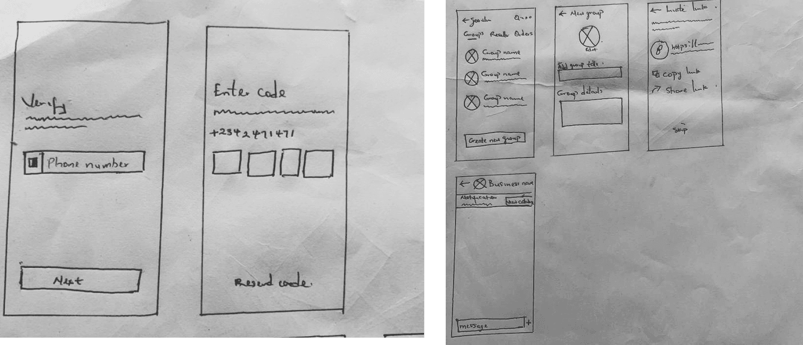
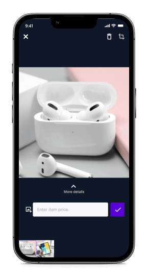
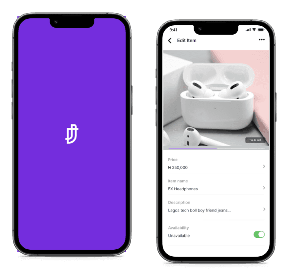
I moved on to creating paper sketches of each screen. This step was easier for me since I already had an idea of the function of each screen. I immediately moved on to wireframing on Whimsical to create low-fidelity versions of my design ideasPrototyping

UX - Navigation
To determine the type of navigation bar I have to use, I had categorised the core functions of the Joovlin App based on the insights of the user research. Every other features go in the following three categories

GROUP: Every user can create and join groups. Therefore, all users must have access to every features allowing them to be A supplier or Reseller. The groups contain chat, purchase and catalogue viewing features
DISCOVER: Users can navigate to the discover page to explore items/products and created groups to find their interests.
LISTS: Users should be able to interact with items/ products they’ve saved or purchased from suppliers through their groups.
For now other navigation items (features) will go in the top menu button. Deciding these categories was simpler than I epected, although it was difficult naming them. Until now I doubt I have the correct names for the navigations. This is part of my objective for my next user testing. For now
Design System
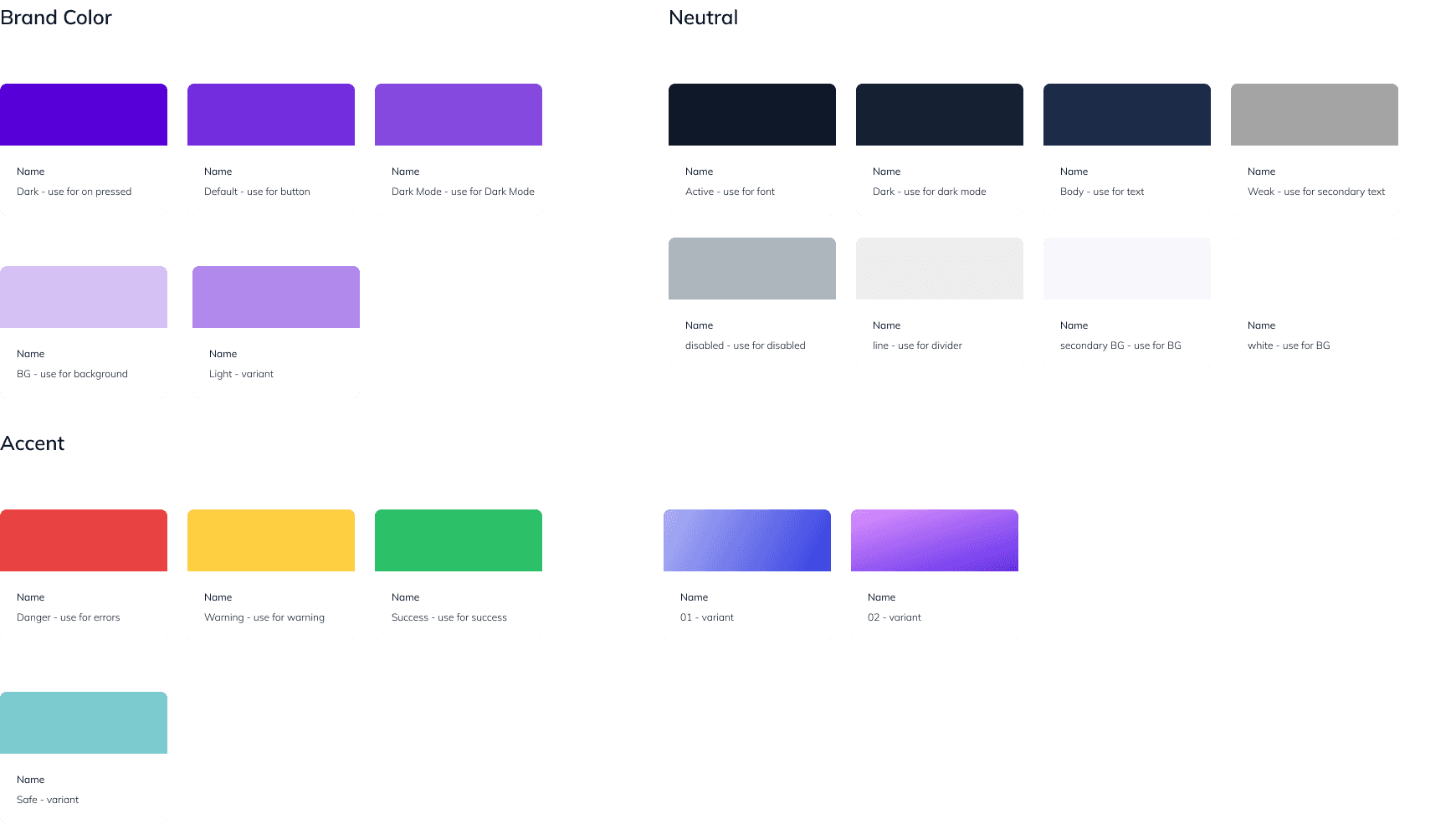
I continued by creating a design system of components I thought were important in the begining including: Typography, Colors and Buttons. As I went on into the hi-fi screen designs, I discovered I needed more components predetermined including: Icons, Shadows and Input fields.
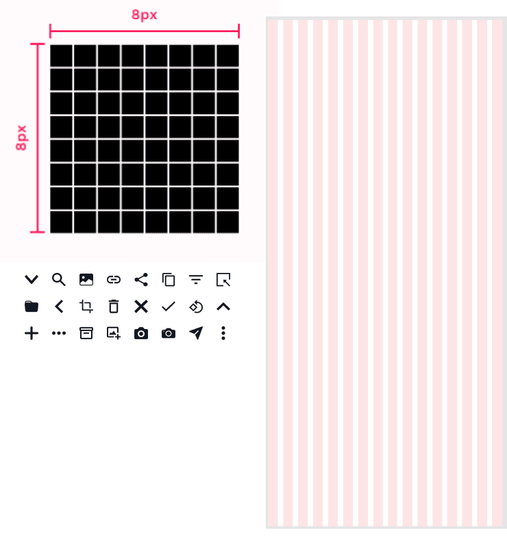
8-point Grid system
I have always wanted to be intentional about my grid system. I have learned about the 8-pt grid being a good way layout a UI project. I did this starting from my Typography, to icons and grid layout. For my layout grid, I used 16 columns and a 8px gutter. This gave me a 16px margin around each screen page
Implementing Gestalt Principles of Design
It was my first time hearing about the gestalt principle. During my entire process, I didn’t think precisely about the principles, I simply designed the way I was used to. In the end, I discorvered I had obeyed most of them, which I found very motivating. I therefore decided to watch youtube videos to learn more about the principles and compare my designs for relevance to the gestalt laws. While there are more screens to illustrate these perceptions, I decided to pick one instance per principl
Similarity
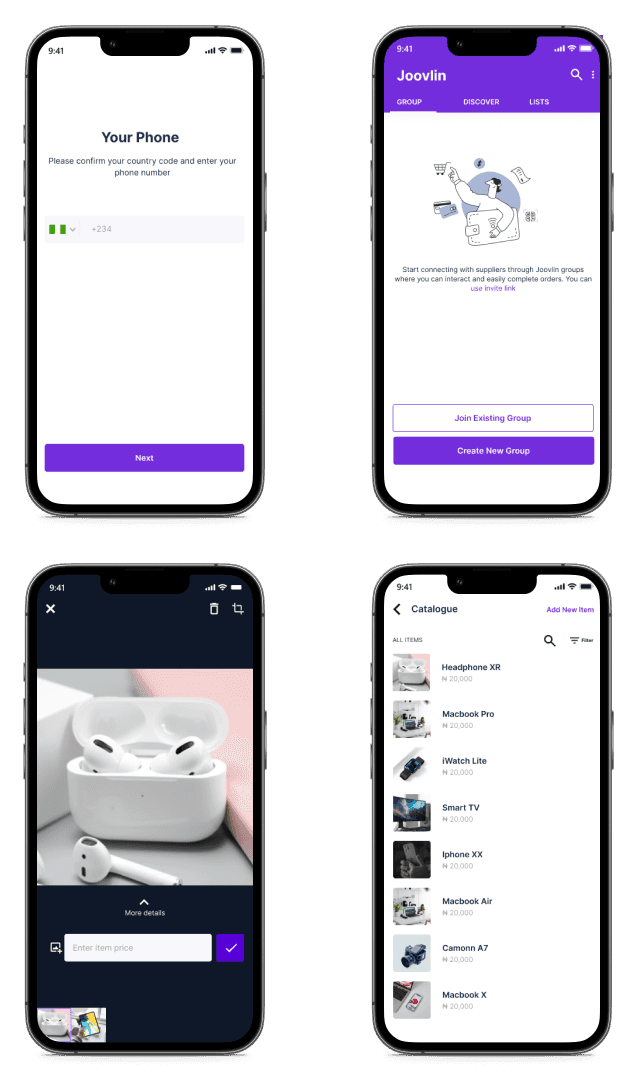
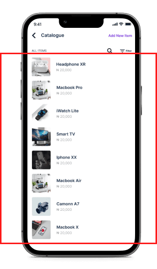
Similar objects are visually grouped. The catalogue cards on this screen are given a similar layout to achieve this.
Proximity
Items closer to each other are concived to have the same function, or pointing towards similar meanings. Here, I kept the ‘Share link’ and ‘copy link’ close to the invite link. And the skip button at the bottom of the screen since it doesn’t contribute to the function of the page

Closure
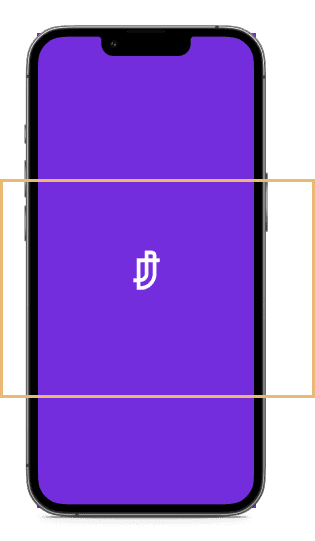
The letter J of the Joovlin logo on the splash screen is an example of the use of closure in my design. Other examples are in my icon choices.
Common region
Items in the same region are classifined to be in the same group. I used the faint purple outline to group the item images along with thier prices on this screen.

Usability Heuristics
Reading through the heuristics has really helped to improve my designs. It helpe me think of UI design as beyoond being an Art. Knowledge of user’s emotions and experience is as much important. Once I read this, I have been adding more screens to my design which were in the beginning not important to me.
Visibility of system status
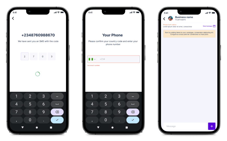
Loading, error and prensent states are shown to the users when necessary
Match between system and the real world
I made sure to use familiar illustations and icons to support my CTAs and contents.
User control and freedom
I became more aware of creating a free app where users don’t feel like they’ve gotten into trouble by making wrong clicks. Cancel and back icons are big and bold.
Consistency and standards
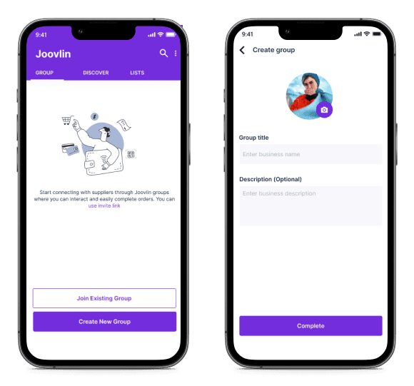
To avoid making my users overthink each steps, I kept to standards. For example, uploading a profile picture.

Aesthetic and minimalist design
I always keep my designs simple with only important features. Also, I’m learning to be able to create more aestethically pleasing designs.
User Testing
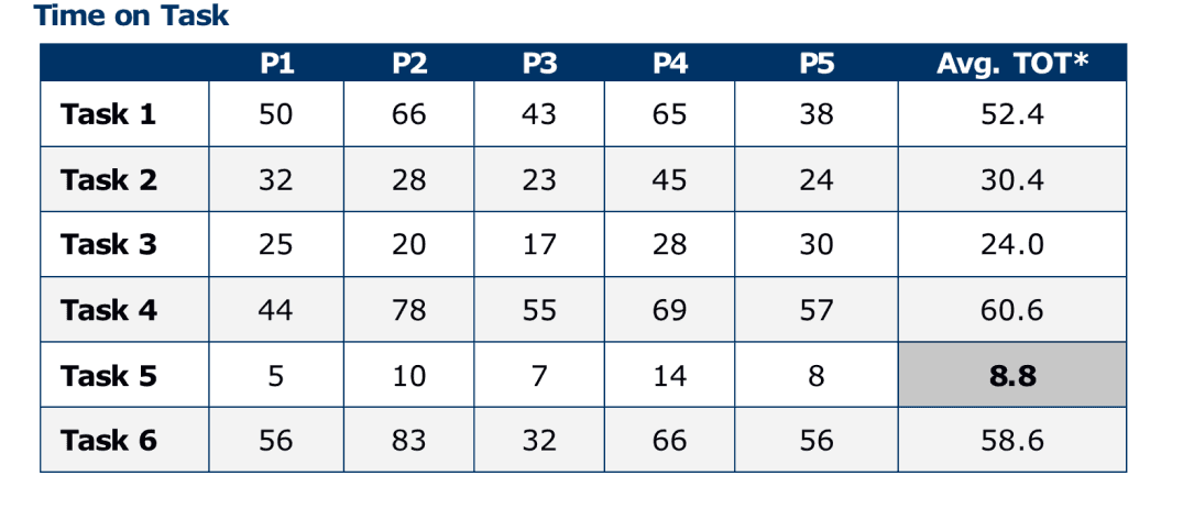
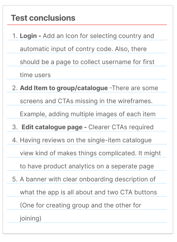
During the sprint, I didn’t have enough time to test. I was however able to squeeze out some time to test out my wireframes with the help of my nearby family and friends. I focused on testing six features included in the first sprint. I got 5 participants to sit with me one-on-one. I showed them the wireframes asking them to perform some tasks one screen at a time. I measured their success rate and duration of completion.


Next step
The Joovlin App is a continuous project. Next, I plan to carry out some user testing. This time, I want to do it better. Afterwards, I will go over the entire process again for the next stories and keep handing off to the developers on the team. I plan to arrive Berlin by the end of this month, finally, I can be more relaxed and free from the bureaucracies of Visa application. I plan to learn all on my screen and navigation bucket-list of interests on my arrival.
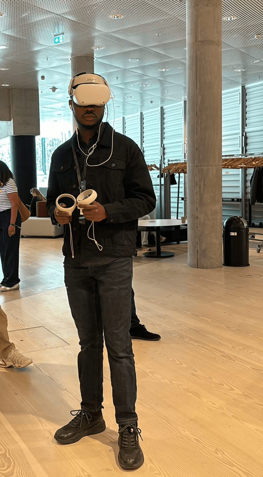
How might we use Augmented reality to get users engaged with stories beyond the capabilities of videos and Photos
Project Description
Then targets young German football enthusiasts. Our project adds to the immersiveness of the experience of reading a story by allowing users to become immersed in the story interactively and playfully. This is unique because it uses augmented reality coupled with other forms of visual storytelling to create a journalistic project.